
[ Return ]

| >> | No. 2416
2416
Post some of your favorites. |
| >> | No. 2417
2417
Comic sans. |
| >> | No. 2418
2418
>>2416 |
| >> | No. 2419
2419
>>2416 |
| >> | No. 2420
2420
americanTypewriter.png >>2419 |
| >> | No. 2421
2421
I find it curious that I was fine with Times New Roman when that was the default in Office, yet now if I see it on a website (usually unstyled), it looks horrible. |
| >> | No. 2422
2422
00000001.jpg 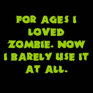
>>2421 |
| >> | No. 2425
2425
Trebuchet, of course. |
| >> | No. 2426
2426
357px-Tahoma.svg[1].png 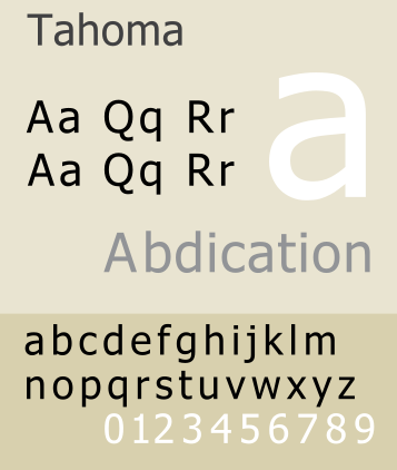
I've always quite liked Tahoma. |
| >> | No. 2427
2427
Calibri_font.jpg.gif  Sexy as fuck lads |
| >> | No. 2432
2432
>>2426 |
| >> | No. 2467
2467
6a0120a85dcdae970b0120a86da307970b.png  >>2425 |
| >> | No. 2469
2469
>>2427 |
| >> | No. 2470
2470
baskerville-sample1.gif 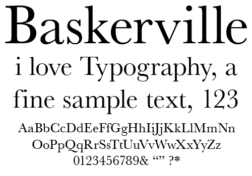 Obvo. |
| >> | No. 2475
2475
palatino.png  Palatino. |
| >> | No. 2476
2476
Screen shot 2010-06-16 at 19.01.11.png 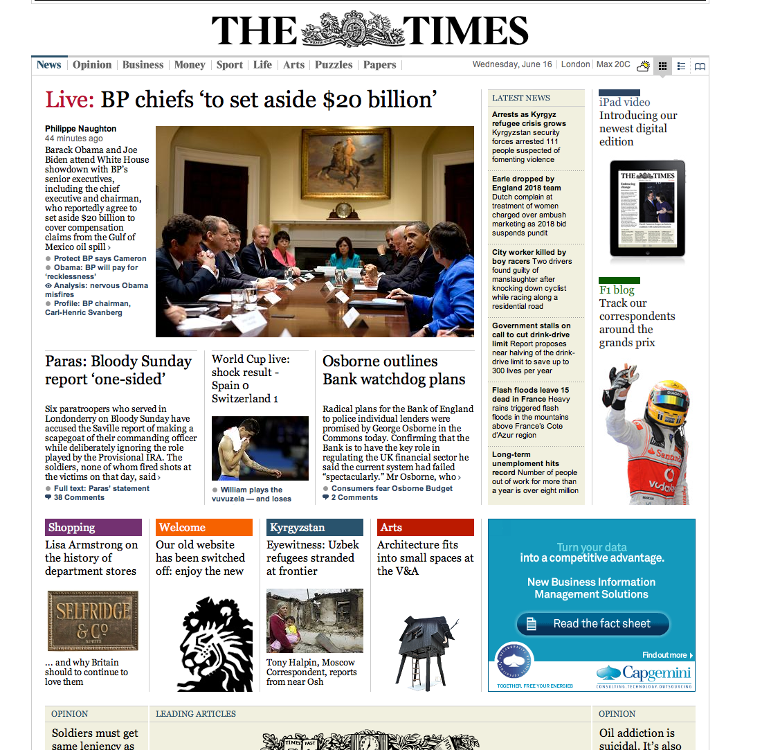
Times done right can look awesome. It's all in the kerning I think. |
| >> | No. 2507
2507
C_JANQ-10005000[1].gif  Janson. |
| >> | No. 2510
2510
>>2507 |
[ Return ]

|
Delete Post [] Password |